
| Index | Value | 1mo change | 1yr change | 5yr change | Inflation Score |
|---|---|---|---|---|---|
| Economic Inflation | |||||
| Consumer Price Index (CPI) | 237.34 | -0.21% | 0.50% | 8.47% | 2 |
| Producer Price Index (PPI) | 183.80 | -1.13% | -6.70% | -3.11% | 1 |
| 1 Yr Treasury Bill Yield | 0.65% | 0.17 | 0.44 | 0.36 | 2 |
| 10 Yr Treasury Note Yield | 2.24% | 0.04 | 0.12 | -1.15 | 2 |
| Real Interest Rate | 0.65% | 0.67 | 1.20 | 1.86 | 3 |
| US 10 yr TIPS | 0.69% | 0.11 | 0.28 | -0.37 | 2 |
| Capacity utilization | 76.50 | -0.65% | -3.16% | 0.92% | 2 |
| Industrial Production Index | 106.02 | -0.48% | -1.75% | 9.99% | 3 |
| Personal Consumption Expenditure Index | 12,430.7 | 0.30% | 2.94% | 19.53% | 3 |
| Rogers International Commodity Index | 2032.03 | -4.63% | -26.08% | -47.85% | 1 |
| SSA COLA | 0.00% | 0.00% | 3 | ||
| Median Income | $53.657.00 | 0.13% | 7.79% | 3 | |
| Real Median Income | $53,657.00 | -1.48% | -2.31% | 3 | |
| Consumer Interest in Inflation | Stable | 3 | |||
| IAG Inflation Composite | Strong Deflation | 1 | |||
| IAG Online Price Index | Slight Deflation | 2 | |||
| US GDP | 18060.20 | 0.82% | 3.07% | 19.94% | 4 |
| S&P 500 | 2012.66 | -4.28% | -0.77% | 56.92% | 4 |
| Market Cap to GDP | 107.10% | 120.10% | 81.80% | 4 | |
| Corporate Debt as % of Equity | 39.00% | 3.80 | 5.10 | -8.20 | 1 |
| US Population | 322,536 | 0.06% | 0.73% | 4.12% | 2 |
| IAG Economic Inflation Index* | Slight Deflation | 2 | |||
| Housing Inflation | |||||
| Median Home price | 220,300.00 | 0.55% | 6.32% | 29.44% | 4 |
| 30Yr Mortgage Rate | 3.96% | 0.02 | 0.10 | -0.75 | 4 |
| Housing affordability | 167.40 | 0.42% | -2.62% | 4 | |
| US Median Rent | 799.00 | 6.22% | 15.71% | 4 | |
| IAG Housing Inflation Index* | Mild Inflation | 4 | |||
| Monetary Inflation | |||||
| US Govt debt held by Fed (B) | 2,797.50 | 0.15% | 7.00% | 260.18% | 1 |
| US Debt as a % of GDP (B) | 100.50% | -0.83% | -1.22% | 10.44% | 2 |
| M2 Money Stock (B) | 12,424.40 | 1.04% | 5.99% | 40.71% | 4 |
| Monetary Base (B) | 3,869.41 | -3.97% | -2.11% | 89.92% | 2 |
| Outstanding US Gov’t Debt (B) | 18,150,618 | -0.01% | 1.83% | 33.84% | 3 |
| Velocity of Money [M2] | 1.49 | -0.73% | -2.68% | -14.56% | 2 |
| US Trade Balance | -42,374.00 | 4.95% | -5.88% | -12.21% | 1 |
| Big Mac Index | Expensive | 1 | |||
| US Dollar | 98.76 | -1.49% | 8.75% | 24.52% | 1 |
| IAG Monetary Inflation Index* | Mild Deflation | 2 | |||
| Energy | |||||
| Electricity (cents / KW hour) | 12.73 | 1.03% | 1.03% | 3 | |
| Coal (CAPP) | 43.50 | -11.22% | -22.74% | -41.61% | 1 |
| Oil | 37.60 | -9.90% | -30.06% | -58.82% | 1 |
| Natural Gas | 2.37 | 6.10% | -16.84% | -51.91% | 1 |
| Gasoline | 1.28 | -3.40% | -13.88% | -47.50% | 1 |
| IAG Energy Inflation Index* | Strong Deflation | 1 | |||
| Food and Essentials | |||||
| Wheat | 472.75 | -0.26% | -19.84% | -40.42% | 1 |
| Corn | 359.50 | -3.43% | -9.27% | -42.59% | 2 |
| Soybeans | 863.00 | -2.76% | -15.52% | -38.18% | 1 |
| Orange Juice | 144.80 | 1.83% | 3.61% | -12.24% | 4 |
| Sugar | 15.18 | 2.22% | 4.55% | -52.96% | 4 |
| Live Cattle | 135.58 | -3.94% | -18.07% | 25.13% | 1 |
| Cocoa | 3214.00 | -3.89% | 10.18% | 6.18% | 5 |
| Coffee | 126.15 | 5.13% | -23.57% | -47.22% | 1 |
| Cotton | 63.28 | 0.86% | 4.99% | -56.35% | 4 |
| Stamps | $0.49 | 0.00% | 6.52% | 11.36% | 4 |
| CRB Foodstuffs Index | 333.25 | -8.36% | -9.74% | -25.37% | 2 |
| IAG Food and Essentials Inflation Index* | Mild Deflation | 2 | |||
| Construction and Manufacturing | |||||
| Copper | 2.13 | 4.07% | -24.49% | -52.11% | 1 |
| Lumber | 256.20 | 3.81% | -22.60% | -20.71% | 1 |
| Aluminum | 0.66 | -2.24% | -18.13% | -37.62% | 1 |
| CRB Raw Industrials | 406.24 | 1.38% | -17.42% | -30.47% | 1 |
| Total Construction Spending (M) | 1,122,457.00 | 1.36% | 14.90% | 41.99% | 5 |
| ISM Manufacturing Index | 48.20 | -0.82% | -12.52% | -16.17% | 1 |
| IAG Construction & Manufacturing Index* | Strong Deflation | 1 | |||
| Precious Metals | |||||
| Gold | 1,061.50 | -0.29% | -10.35% | -25.27% | 1 |
| Silver | 13.82 | -1.39% | -12.17% | -55.33% | 1 |
| IAG Precious Metals Inflation Index* | Mild Deflation | 1 | |||
| Innovative Advisory Group Index | |||||
| IAG Inflation Index Composite* | Mild/Strong Deflation | 1 / 2 | |||
* If you would like a description of terms, calculations, or concepts, please visit our Inflation monitor page to get additional supporting information. We will continually add to this page to provide supporting information.
* Our Inflation Score is based on a proprietary algorithm, which is meant to describe the respective category by a simple number. The scores range from 1-5. One (1) being the most deflationary. Five (5) being the most inflationary. These scores are meant to simplify each item and allow someone to quickly scan each item or section to see the degree of which inflation or deflation is present.
* We have also added our own indexes to each category to make it even easier for readers to receive a summary of information.
Inflation Monitor Summary – Composite Ranking

* The Inflation Equilibrium is a quick summary for the whole data series of the inflation monitor. If you don’t like statistics, this is the chart for you.
Inflation Monitor – January 2016 – Introduction
Happy New Year. I hope you enjoyed your holidays with lots of eggnog and holiday cheer.
2016 has started with a bang… or rather a thud. The US equity markets have had their worst start to the new year ever. I guess you could say that the thud has not happened yet since the US stock markets are still falling. The Chinese stock markets have gotten all the blame, but I think the drop in equities is overdue.
In week one, S&P 500 (-6%), NASDAQ (-7.3%), and Dow (-6.2%). Gold surprised to the upside +3.1%.
End of week two, S&P 500 (-8%), NASDAQ (-10.4%), and Dow (-8.2%). Gold is still up 1.8%.
If you have been following this Inflation Monitor for the past year you will know my thoughts on the markets. We saw strong deflationary data last year. Not surprisingly, no one noticed. The fact that it took the equity markets this long to react to this data is really the only surprise I see.
If you have not read my 2015 recap, then now is a good time to read it. Last year the S&P 500 ended with a performance of -0.7%, which is surprising since many blue chip companies were down between -10% & -20% for the year. If you did nothing but look at the index, you would have missed the large dislocation of the index performance and the performance of the underlying stocks.
The risk you should consider this year is contagion. This is the risk of assets selling off because other assets are selling off, having very little to do with underlying fundamentals. For example, if the high yield bond market continues to sell off or worse yet, crashes, then the investment grade corporate bond market may also sell off. This could lead to a sell-off in equities and other assets. The spread of this contagion is not knowable, but you should be aware of this risk.
I recently wrote a financial planning post on creating an Emergency Fund – The Importance of Cash. This post discusses an important concept that many people ignore due to the popular use of credit over cash. I recommend you read this to see how you can reduce your financial risk. This concept also is important when it comes to having cash as an allocation in your portfolio. If you do not use cash as a portfolio position, then you are missing out on one of the best risk management tools available.
If you follow investment banks such as Goldman Sachs, this is the conclusion from the Goldman Sachs 2016 Outlook,
We recommend clients stay invested at their strategic allocation to US equities. We expect modest single-digit returns for a moderate-risk, well-diversified portfolio given current valuations and interest rates across the globe. While we are cautiously optimistic, we nonetheless remain vigilant given the broad range of risks that continue to confront us in 2016. Of course, should the economic, financial or geopolitical backdrop change materially, we will adjust—and communicate—our views accordingly.
I have no words. This is the last page of the report, the “conclusion”. While this may be a conclusion, it reads more like a disclaimer. I think this report was meant for the “muppets”. I’ll try to paraphrase it for you, “You should keep your money in the markets. BTW we see a lot of risks out there, so if you lose money, we told you so.” Whoever wrote this has a sense of humor.
Typically I don’t spend this much time talking about the equity markets in the Inflation Monitor, but considering the interesting outcome of the past 12 months and the last 2 weeks, it was worth a mention.
In the past, I have talked about the Japanese and their 3 decade-long deflation. The Japanese are not the only ones to experience deflation. Most counties around the world are experiencing strong deflationary pressures with the large drop in commodity prices over the past few years. Countries like Canada, which have a large portion of their economy dependent on commodities, are also trapped under a strong weight of deflation.
As the US Dollar continues to strengthen it will weigh on the rest of the world’s economies. The US economy has been unusually strong compared to the rest of the world. This condition cannot continue indefinitely. I would suggest that you consider assets that are deflation-proof and focus on safety rather than return. The most important thing to understand about bear markets and deflationary periods is to adjust your thinking from making money to preserving what you have. Risk management should be your top priority.
I hope you enjoy this month’s Inflation Monitor – January 2016.
Kirk Chisholm
As always, please contact me with any questions or to send your feedback. Thank you for reading.
Join our email list to receive the Inflation Monitor sent directly to your inbox.
![]()
Charts of the Month
Leading Indicators
Dr. Copper
Dr. Copper is still weak. the downtrend is continuing. At some point, there will be a tremendous opportunity to buy this essential metal, but right now investors of copper are running for the exits. The beginning of next year might send a rise in prices (briefly).

Financials
Financial are holding steady. Fed decided to raise interest rates in December, that could help the financials. However, the yield curve is still flat and getting flatter with the short end of the curve rising and the longer end not rising. So the “help” might be insignificant with all the penalties, fee, fines, etc they are paying.

Consumer Price Ratio (CPI)
The CPI is flat for the year. If you have read this Inflation Monitor report for the last 12 months you will know that strong deflationary forces are here to stay. The Fed does not want deflation in the US, but can they stop it? We will find out soon enough what tricks they have up their sleeve.

Producer Price Index (PPI)
The Producer Price Index is continuing to have a rough time this year. The declining PPI might be a reflection of the new economic conditions of producers and manufacturing with a high value of the US Dollar. This makes it harder for US companies to export goods since they will be about 20% more expensive from where they were last year.

CPI Vs. PPI
It doesn’t take a rocket scientist to figure out that sometime is wrong with this picture. If you do happen to be a rocket scientist, we won’t hold that against you.

US Velocity of Money M2
There is just no sign of stopping this falling safe. I’ll believe in the hyper-inflation tooth fairy when this starts to turn up in a meaningful way.
")
ISM Manufacturing
More bad news in the US economy. Eventually, stock prices may react. Let’s see how far it goes.

Gas Prices in Massachusetts

“We keep thinking that lower energy prices are somehow good for the economy. That can’t be, because energy prices or commodity prices in general don’t drive economic growth. Economic growth drives commodity prices.”
~Stephen Schork
Gas prices have dropped to more reasonable levels, but I think we could still drop lower. Oil prices have already hit $30 a barrel in the first 2 weeks this year. I suspect they could continue lower. Of course, there is a limit to what is reasonable, but as long as more oil is produced than is consumed, prices will continue to drop. We have already broke below the 2009 lows. Maybe when the oil company hedges run out things will change… or maybe they won’t.

Gas Prices in the US

Currency Relative Valuations to Gold
Gold is priced in the currency you use every day. If you live in the European Union, you use Euros, if you live in Japan, you use Yen, and if you live in the US you use US dollars. Each of these currencies are used to buy gold in their respective countries, so we look at gold priced in each country to see how people value it in their own currency. This can tell us a lot about the demand for gold inside and outside the US.
Gold prices are they strong or weak?

Gold Priced in Euros

Gold Priced in Yen

Gold Priced in Canadian Dollars

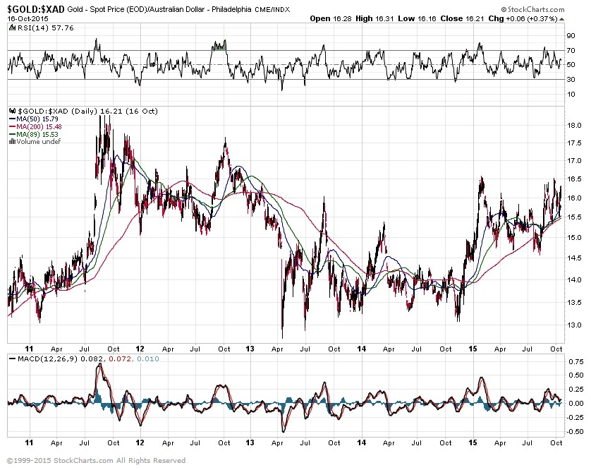
Gold Priced in Australian Dollars

Bonds
TED Spread
A surge in the Ted Spread means a lack of trust in financial institutions. This is not a good trend, although it is off low. It is far off the 2008 highs of 4.6, but the upward trend is not a good sign, since it is confirming many other indicators.

10 year vs. 2 year Treasury Spread
The flattening (or inverting) of the yield curve is not good for banks and also typically shows signs on a recession. It is probably one of the best indicators of a recession we have, yet no one knows the status since interest rates are stuck at zero… sorry 0.25% -0.50%

Treasury vs Corp Bond Spread
The spread between 30-year treasuries and corporate bonds is relatively high, as it can be in times of market distress. It will be interesting to see how this plays out as interest rates start to rise… assuming they ever do.

High Yield Bonds (Junk Bonds)
High yield bonds have had a good run of very low default rates. 2014 was around 1%. During recessions, these default rates tend to climb up to around 10% (1991, 2001, 2002, and 2009). This is fine unless you are getting 5% on your high yield bond income. In that case, you would net -5% a year. I’ll bet that is not quite what you had in mind when you were looking for income.
It is important to point out that high-yield bonds are going through a period of turmoil. Recently 3 high yield funds have closed their doors due to investors pulling their money out. You can read about this turmoil and the blueprint for financial contagion in my 2015 year end recap.

This shows the price of 30-year treasuries vs high yield bonds. Right now a higher number means that high yield bond prices are dropping farther than treasuries. Late 2011 was during the euro crisis. I think we have much to be concerned about with high yield bonds. A diversified portfolio is always a good idea, but it doesn’t mean you have to have an allocation to assets that are is a tailspin. 0% is sometimes a good allocation percentage.

Bond Yield Spread

High Yield Bond Spread

Inflation Dashboard
I like this view because it gives more of a visual perspective of the data presented above.

All Kinds of Debt
“High debt levels, whether in the public or private sector, have historically placed a drag on growth and raised the risk of financial crises that spark deep economic recessions.”
~The McKinsey Institute
Corporate Debt as a Percentage of Equity

Public and private debt to GDP and Crisis

Baltic Dry Index
If this continues to drop they may have to discontinue the index until later. This chart is just plain ugly. If you are not aware of what this index is, it measures the price of moving major raw materials by sea. Either people have found an easier way to ship goods, or business is slowing globally.

I hope you enjoyed this month’s Inflation Monitor. See you next month.
Cheers,
![]()
Kirk Chisholm
The IAG Inflation Monitor – Subscription Service
We are initially publishing this Inflation Monitor as a free service to anyone who wishes to read it. We do not always expect this to be the case. Due to the high demand for us to publish this service from a wide variety of people who subscribe, we do at some point in the next 12 months expect to charge for this service. Our commitment to our wealth management clients is to always provide complimentary access to our research. If you would like to discuss becoming a wealth management client, feel free to contact us.
If you would like to automatically receive the Inflation Monitor in your email inbox each month, click here to join our free subscription service.
![]()
Sources:
- Federal Reserve – St. Louis
- U.S. Energy Information Administration
- U.S. Post Office
- TD Ameritrade
- National Association of Realtors
- The Economist
- The Commodity Research Bureau
- Gurufocus.com
- Stockcharts.com
- GasBuddy
* IAG index calculations are based on publicly available information.
** IAG Price Composite indexes are based on publicly available information.
About Innovative Advisory Group: Innovative Advisory Group, LLC (IAG), an independent Registered Investment Advisory Firm, is bringing innovation to the wealth management industry by combining both traditional and alternative investments. IAG is unique in that we have an extensive understanding of the regulatory and financial considerations involved with self-directed IRAs and other retirement accounts. IAG advises clients on traditional investments, such as stocks, bonds, and mutual funds, as well as advising clients on alternative investments. IAG has a value-oriented approach to investing, which integrates specialized investment experience with extensive resources.
For more information, you can visit: innovativewealth.com
About the author: Kirk Chisholm is a Wealth Manager and Principal at Innovative Advisory Group. His roles at IAG are co-chair of the Investment Committee and Head of the Traditional Investment Risk Management Group. His background and areas of focus are portfolio management and investment analysis in both the traditional and non-traditional investment markets. He received a BA degree in Economics from Trinity College in Hartford, CT.
Disclaimer: This article is intended solely for informational purposes only, and in no manner intended to solicit any product or service. The opinions in this article are exclusively of the author(s) and may or may not reflect all those who are employed, either directly or indirectly or affiliated with Innovative Advisory Group, LLC.