| Index | Value | 1mo change | 1yr change | 5yr change | Inflation Score |
|---|---|---|---|---|---|
| Economic Inflation | |||||
| Consumer Price Index (CPI) | 237.43 | -0.25% | 1.56% | 9.66% | 2 |
| Producer Price Index (PPI) | 203.60 | -1.40% | 0.54% | 16.21% | 2 |
| 1 Yr Treasury Bill Yield | 0.13 | 0.03 | 0.01 | -0.18 | 4 |
| 10 Yr Treasury Note Yield | 2.22 | -0.06 | -0.68 | -1.37% | 4 |
| Real Interest Rate | -1.46 | 0.26 | -0.62 | -2.01 | 4 |
| US 10 yr TIPS | 0.43% | 0.05 | -0.12 | -0.85 | 2 |
| ISM Manufacturing Index | 58.70 | -0.51% | 2.98% | 7.90% | 4 |
| Capacity utilization | 78.90 | -0.50% | 0.90% | 13.85% | 4 |
| Industrial Production Index | 104.86 | -0.21% | 4.00% | 21.49% | 4 |
| Personal Expenditure Consumption Index | 109.23 | 0.07% | 1.44% | 8.40% | 2 |
| Rogers International Commodity Index | 3009.76 | -6.53% | -13.46% | -7.50% | 2 |
| SSA COLA | 13.30% | 1.70% | 3 | ||
| Median Income | 51,939.00 | 1.81% | 3.25% | 3 | |
| Real Median Income | 51,939.00 | 0.35% | -4.56% | 3 | |
| Consumer Interest in Inflation | stable | 3 | |||
| IAG Inflation Composite | Mild Deflation | 2 | |||
| IAG Online Price Index | -0.45% | 1.38% | 11.68% | 2 | |
| US GDP | 17535.40 | 1.20% | 3.93% | 21.91% | 4 |
| S&P 500 | 2067.56 | 4.16% | 14.49% | 99.53% | 5 |
| Market Cap to GDP | 125.40% | 120.10% | 115.30% | 80.90% | 5 |
| US Population | 319,485 | 0.06% | 0.70% | 4.00% | 2 |
| IAG Economic Inflation Index* | Stable | 3 | |||
| Housing Inflation | |||||
| Median Home price | 208,300.00 | -0.38% | 5.47% | 20.96% | 4 |
| 30 Yr Mortgage Rate | 4.00% | -0.04 | -0.26 | -0.88 | 4 |
| Housing affordability | 165.90 | 4.54% | -0.90% | 3 | |
| US Median Rent | 756.00 | 2.72% | 5.57% | 3 | |
| IAG Housing Inflation Index* | Stable | 3 | |||
| Monetary Inflation | |||||
| US Govt debt held by Fed (B) | 2,705.90 | 3.49% | 39.72% | 312.17% | 1 |
| US Debt as a % of GDP (B) | 101.53% | -0.22 | 2.59 | 18.73 | 2 |
| M2 Money Stock (B) | 11,506.90 | 0.60% | 5.59% | 36.92% | 4 |
| Monetary Base (B) | 3,851.04.62 | -4.17% | 3.94% | 88.19% | 4 |
| Outstanding US Gov’t Debt (B) | 17,824,071 | 1.09% | 6.05% | 49.66% | 4 |
| Total Credit Market Debt (B) | 57,981.79 | 0.72% | 3.65% | 10.52% | 4 |
| Velocity of Money [M2] | 1.53 | -0.20% | -2.36% | -10.41% | 2 |
| US Trade Balance | -43,032.00 | -0.39% | 11.13% | 28.40% | 5 |
| Big Mac Index | slightly expensive | 2 | |||
| US Dollar | 88.40 | 1.55% | 9.56% | 18.06% | 2 |
| IAG Monetary Inflation Index* | Stable | 3 | |||
| Energy | |||||
| Electricity (cents / KW hour) | 12.94 | -0.54% | 3.60% | 3 | |
| Coal (CAPP) | 53.10 | -0.19% | 2.12% | -18.31% | 3 |
| Oil | 66.00 | -18.54% | -28.86% | -14.60% | 1 |
| Natural Gas | 4.08 | 5.61% | 3.29% | -15.76% | 4 |
| Gasoline | 1.62 | -25.83% | -39.17% | -19.44% | 1 |
| IAG Energy Inflation Index* | mild deflation | 2 | |||
| Food and Essentials | |||||
| Wheat | 578.50 | 8.79% | -13.50% | -1.74% | 2 |
| Corn | 389.75 | 3.59% | -8.35% | 6.65% | 2 |
| Soybeans | 1014.00 | -1.55% | -24.14% | -4.38% | 1 |
| Orange Juice | 149.10 | 7.97% | 7.27% | 24.67% | 4 |
| Sugar | 15.59 | -2.62% | -9.36% | -31.32% | 2 |
| Pork | 89.73 | 1.73% | 4.94% | 34.17% | 3 |
| Cocoa | 2855.00 | -1.55% | 1.96% | -12.07% | 3 |
| Coffee | 187.45 | -0.56% | 68.72% | 32.29% | 5 |
| Cotton | 60.10 | -6.71% | -23.49% | -19.21% | 1 |
| Stamps | $0.49 | 0.00% | 6.52% | 11.36% | 4 |
| CRB Foodstuffs Index | 390.88 | -1.76% | 1.14% | 12.27% | 3 |
| IAG Food and Essentials Inflation Index* | mild deflation | 2 | |||
| Construction and Manufacturing | |||||
| Copper | 2.84 | -7.06% | -11.28% | -10.47% | 1 |
| Lumber | 329.30 | 1.11% | -10.25% | 31.98% | 2 |
| Aluminum | 0.90 | 4.17% | 5.40% | -10.41% | 4 |
| CRB Raw Industrials | 504.51 | -0.39% | -3.86% | 47.51% | 2 |
| Total Construction Spending (M) | 970,989.00 | 1.11% | 3.30% | 7.41% | 3 |
| IAG Construction & Manufacturing Index* | Mild Deflation | 2 | |||
| Precious Metals | |||||
| Gold | 1,165.80 | -0.66% | -6.32% | -1.40% | 2 |
| Silver | 15.46 | -1.15% | -22.78% | -16.57% | 1 |
| IAG Precious Metals Inflation Index* | Deflationary | 1 | |||
| Innovative Advisory Group Index | |||||
| IAG Inflation Index Composite* | mild deflation | 2 | |||
* If you would like a description of terms, calculations, or concepts, please visit our Inflation monitor page to get additional supporting information. We will continually add to this page to provide supporting information.
* Our Inflation Score is based on a proprietary algorithm, which is meant to describe the respective category by a simple number. The scores range from 1-5. One (1) being the most deflationary. Five (5) being the most inflationary. These scores are meant to simplify each item and allow someone to quickly scan each item or section to see the degree of which inflation or deflation is present.
* We have also added our own indexes to each category to make it even easier for readers to receive a summary of information.
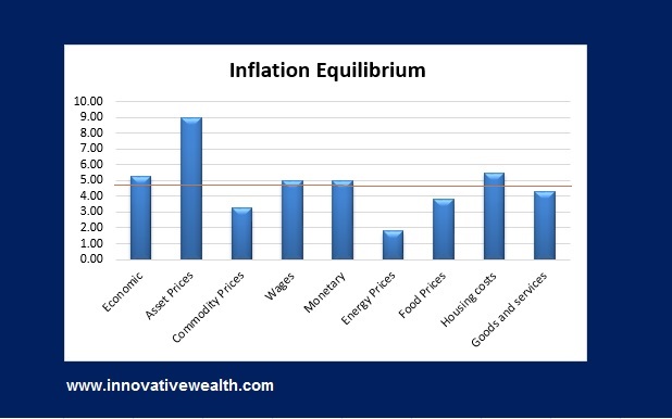
Inflation Deflation Composite Ranking
* The Inflation Equilibrium is a quick summary for the whole data series of the Inflation Monitor. If you don’t like statistics, this is the chart for you.
Inflation Monitor December 2014 – Introduction
This is the third issue of the Innovative Advisory Group Inflation Monitor. As you will notice, we have made some additional changes to the inflation monitor based on your feedback. Keep the feedback coming, since this will ultimately benefit you. As always, please contact me to send your feedback on how I can make this monthly Inflation monitor a better tool or resource for you.
This month I have added the following indicators:
- US Population
In this month’s issue, I will be discussing interest rates, gas prices, Gold and Silver, and more. Given the recent sell off in the price of oil and drop in interest rates, I think it would be a good time to discuss the effects on the US economy.
Thank you for reading and I hope you enjoy this month’s issue of the Inflation Monitor.
Kirk Chisholm
Inflation Monitor December 2014 – Summary
What is going on with interest rates?
Someone asked me the other day where I thought someone should go if they were looking for bonds. While this is a similar conversation to others I have had over the past 5 years, there is one thing that hit me that caused me to rethink my position. US Treasuries.
High Yield Bonds
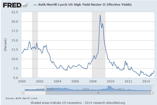
Many institutional investors are stuck in a dilemma. They need to invest in fixed income for various reasons, but the yields are extremely unattractive. This year high yield bonds hit a high around June or August depending on what index you follow. If you look at the BofA Merrill Lunch US High Yield Master II Effective Yield(c), the yield got as low as 5.16% on June 23, 2014.
This is also when the option adjusted spread for this index hit its low point of 3.35% over the US Treasury spot curve.1
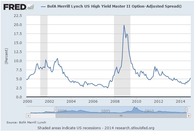
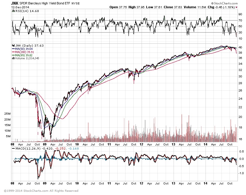
This shows that investors were willing to accept 3.35% extra yield for a large amount of risk. Treasuries are essentially a risk-free yield. High yield bonds have a historical default rate of 5% according to Russell Investments. However, defaults have reached up to the low to mid teens in the past. Let’s just say that the default rate is 5% and the yield is 5.16%, you would effectively be only getting 0.16% for owning the high yield bonds. Not an attractive investment from my point of view. The chart below shows how high yield bonds have performed in the past 7 years. It looks a lot like the returns for stocks.
US Treasuries & sovereign bonds
Now lets look at US Treasury bonds. US Treasuries fall in the sovereign bond category in that they are issued by a sovereign nation and are backed by the taxing power of that nation and their willingness to pay. Under normal circumstances, the yields of these sovereign bond would be higher for higher risk countries and lower for lower risk countries. Look at the chart of these sovereign bonds:
I cannot tell which countries are high risk or low risk just from looking at this chart.
This is a list of 10-year government bonds. If you only look at the nations with larger economies, the only countries with higher yields than the US are: China, Australia, and Russia. So you can have a no-risk yield of 2.16% or try for a little higher yield and take risk. It would seem to me that the 10 year US Treasury is attractive on a relative basis.
That being said 2.16% is still really low for 10 years. What choices do you have?
It would seem to me that with many of the developed nations (Japan, Europe, China, and more) are in or near recession and the US economy plugging along at a safe pace, that US Treasuries are one of the better places to invest in the fixed income space. Even if the US slides into a recession, the price of the bonds will appreciate, and you will still get the coupon.
Why would I invest in a bond that pays 2% annually for 10 years?
While I contemplated the idea of where to invest for yield and cash flow, I considered other areas which still have reasonable yields. Real Estate…
Investing in Real Estate for Cash Flow
I have spoken to a few institutional investors who are very cautious about real estate in certain markets. Market like New York are priced to perfection in certain areas with a cap rate of ~2%. While there are parts of the country which may be more reasonable, in general wise investors, who have seen a few cycles, are cashing out, and in some cases even paying the taxes instead of doing a 1031 exchange to put the taxes off until much later. This typically would lead a smart investor to be weary of any investment in real estate until the numbers returned to a more normal state.
I wrote a post yesterday about the state of real estate. Some of the information is dated a few months ago, but I thought it would fit nicely with this issue of the inflation monitor.
“May you live in interesting times” – (falsely attributed as a Chinese Curse)
Yes I have found another falsely attributed quote which is widely known. I have to wonder how many of these there actually are. But I digress…
Despite this uneasy feeling that real estate was too richly valued for someone looking for value investments, I had to wonder what would become real estate if deflation, which has gripped much of the global economy, persisted as it did in Japan for 25 years. What would the world look like if interest rates were 0% for another 20 years? For one, it would make real estate cap rates of 6% look juicy and 10-year treasuries another winner. Trying to imagine that environment makes me very uneasy.
While the low-interest rate environment has squeezed asset prices much higher, I don’t see how rates start to climb much higher given the deflation and economic conditions. I have said this since 2008, and will continue to say it until I things look differently…
” We will have low rates much longer than most people expect.”
Japan, which I discussed last month in the November 2014 Inflation Monitor, has been in a deflationary period for the past 25 years. Instead of allowing the excessive debt to be restructured, as it should in a recession, they have printed more money and debt where their debt to GDP is now over 200% (according to the IMF and CIA Factbook). This puts an enormous burden on the economy to grow. This amount of debt is like trying to run while dragging a car behind you. This is perceived to be the global solution to deflation, despite it not working for 25 years. When you need growth, print more money and add more debt. The theory doesn’t make sense if you stop to think about it. If you are trying to cure an addict of their addiction, do you remove the stimuli or do you give them twice as much? The solution seems simple enough, but for some reason governments are not just doing the wrong thing, they are doing the exact opposite of the right thing.
Economies which grew because they were credit-based have now hit a wall and cannot continue to grow due to the amount of credit growth. There are only a few solutions to this dilemma.
- Inflate away their debt – This is their current solution, and it is not working.
- Default on their debt – This is a solution that many countries have tried in the past and it works, but it also destroys credibility of the borrower. Still, it is better than the first solution.
- Institute a global repricing of assets – This is a solution that is a reasonable but “nuclear option”. This will change many things and will have an unpredictable outcome. While this is most likely the last resort of central bankers and governments, it needs to be acknowledged as an option.
- Take off the training wheels and let the mal-investments work thought the bankruptcy system – This, in my opinion, is the best option, but it will never be tried. Too many people have too much to lose.
- Allow the Central Banks to buy up all the excessive and “bad” debt, then have them forgo their ownership of it – I wrote about this in my letter to the Federal Reserve a few years ago. I still think this is the most practical option.
What do you do about deflation?
As I stated last month in the Inflation monitor, you should seek high-quality yields with steady cash flow, cash, and gold for a hedge against monetary dysfunction. Deflation is not only a difficult environment to make money, but so few people have actually experienced it. This means there will inevitably be many mistakes with investments. The goal during a deflationary period is not to make money, but to keep it.
That is all for this month. I have a few interesting charts below about gold, silver and oil.
Cheers
Charts of the month
US Oil and Gas prices
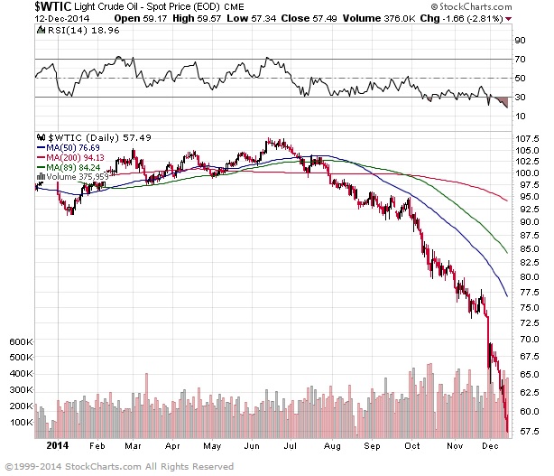
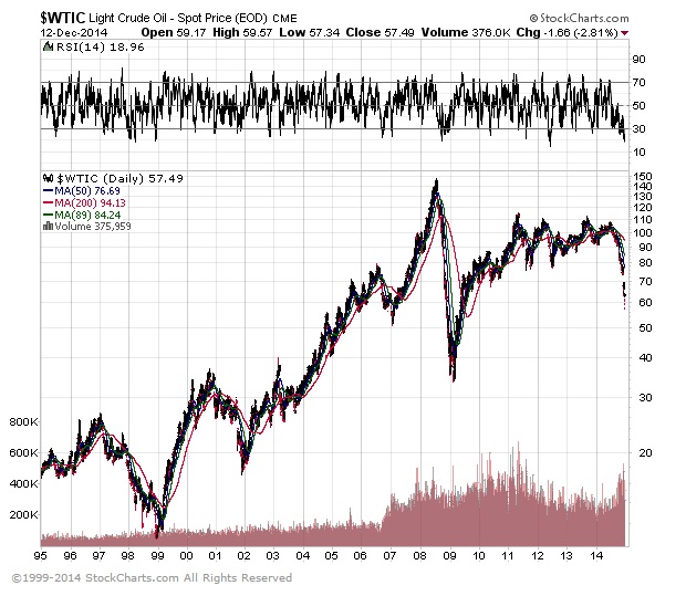
Oil prices have dropped from $107-$108 in July of this year to around $65-$66 as of my writing this. That is a drop of over 39% in the space of a few months. (as I went to publish this the price was down to 57.50… ouch) You would think that gas prices would drop in a similar manner. The futures price for RBOB Gasoline in the near month went from $3.14 to $1.75 during that same time period. Here is a picture of the gas prices at the pump near where I live. This may not be representative of nationwide gas prices, but it is hard to believe. By the way, this is self-service.

Apparently, even though the price of oil and gas has dropped around 40%, the prices at the pump have not moved very much. This looks to be within $0.10-$0.20 of the price for the past year. What is wrong with this picture.
The point of this is not to show that someone is making a large spread on selling gas to individual consumers. It is to show that the drop in oil prices will reduce GDP and tax revenues from the lower oil prices. Although the media has spun this lower oil prices as a great thing for consumers, it won’t be as great as people think. The oil and gas industry provides approximately 7.7% of the GDP in the US as of 2010. While this might actually be higher now due to the increased economic activity with oil and gas production, there is no doubt that the drop in oil prices will have a material impact on economic activity in the US.
Lower oil prices typically translate into a forewarning of a recession. However this time, part of the reason for lower prices is that there is a lot of excess supply due to the US rapidly expanding their oil production compared to years past. Time will tell if the drop in oil prices is due to deteriorating economic conditions, or just excess supply. I would estimate that we have another 3 to 4 quarters until we can be sure. Many oil producers have hedged their oil production prices for 1-2 years out, so bankruptcies of over-leveraged producers may take a while. At the moment the US economy looks solid. It will be interesting to see if the global deflationary forces will end up pulling down the US economy to mirror the rest of the world.
I’m sure there are very few people who are not aware of the slide in oil prices, but I think it is important to see this from different perspectives. to grasp the severity of the move which was closely mirrored in precious metals last year.
Gold and Silver ETFs
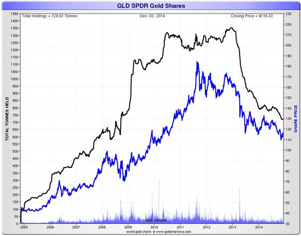
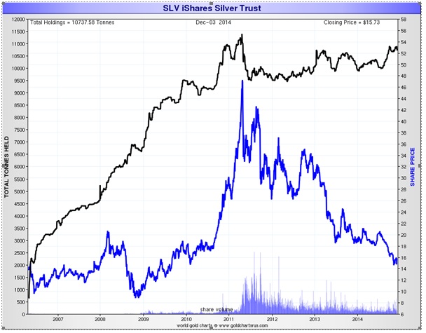
These are two charts of the gold ETF (GLD) and the silver ETF (SLV) these are compared against the shares outstanding for those ETFs. You should notice dichotomy between the SLV and GLD shares outstanding and their respective prices. The gold ETF shares outstanding have continued to decline along with the price of gold, while the shares outstanding for SLV have actually increased (since its initial drop in 2011) while its price has dropped. How could that be? I should acknowledge that no one can truly know. There are many factors involved including: supply and demand, the futures prices of those metals on the COMEX, central bank purchases and sales, and others.
For those who are inclined to believe in the gold and silver price manipulation conspiracy, one possibility for this dichotomy is that the increased amount of shares has allowed the price to be manipulated via naked shorting of the ETF shares. When there are fewer shares outstanding, it gives people a smaller capital base to use to push the price of the metal. This capital base can be compared to the number of contracts traded on the COMEX. While I don’t have space to fully discuss naked shorting of ETF shares, more shares outstanding mainly allows shorts to provide more leverage in pushing the price lower, than if the shorts were required to find enough shares from existing long positions.
The question is, does this relationship between price and shares outstanding between SLV vs GLD mean that naked shorting may be involved? I cannot say for sure, but I suspect it might.
Food Price Inflation in US Dollars vs. Anything Else
Coincidentally FRED published a blog post recently with the following:
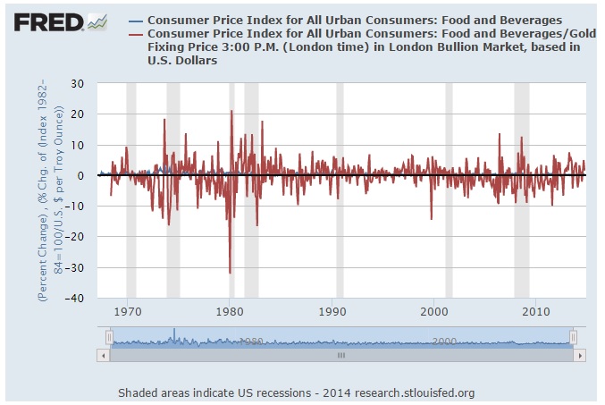
Mr. Zimmerman’s post suggests that because food priced in US dollars is less volatile than food priced in gold, using the US dollar is a better form of currency. There is quite a bit wrong with this thesis. Let’s take a look at his primary hypothesis:
Mr. Zimmerman suggests that the “wild” price changes in food priced in gold terms is due to the inability to “manage” the gold supply, while the Fed can control the money supply of US dollars to maintain “price stability”.
First, food is priced in US dollars so that makes the US Dollar a stable point of comparison. You could not find any other point of comparison which would hold up and make it more stable. This is not because other things are not more or less stable, it is because food is currently priced in US Dollars. This is currently the acceptable standard of payment. I’ll bet if everything was priced in gold, and then you tried to compare it to food priced in Oil or food priced in seashells, those other comparisons would be more volatile. Most of this is due to an economy which is currently basing its prices on a fiat currency.
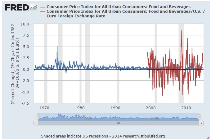
To prove my point, here is the same chart, using food priced in gold and food priced in euros.
I suppose this means Mr. Zimmerman is suggesting that the European Central Bank is not capable of price stability, or that the US dollar is the only point which can be used to compare the price of food. I think it should be clear from this point that pricing anything in a “currency” other than the US dollar is a fools errand. Here is another comparison to consider:

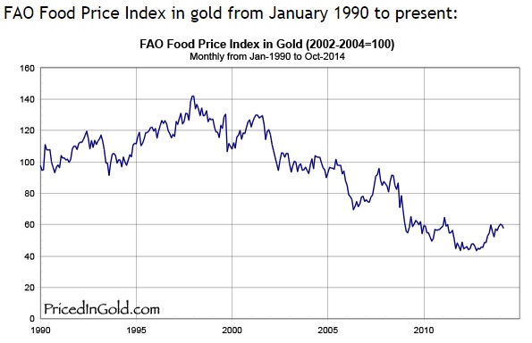
In this chart, it shows the price of food declining compared to the price of gold. Does this mean that food prices are only going up because they are priced in US Dollars. It sure looks that way. However, the declining value of the US Dollar is a different issue worth discussing at a different time. History has shown over hundreds of years that gold is a much more stable valuation method for goods and services. It doesn’t need to be gold, but no one has come up with a better standard yet.
Second, The Federal Reserve is TRYING to peg the US dollar to the rate of inflation in general terms. There is a target rate of inflation they would like to see. They use their monetary tools to help goods and services keep pace with the rate of inflation (measured in the CPI). One of their mandates is price stability. So effectively if the change in food prices was “wild” on a monthly basis, then the Fed would have to be fired for not doing its job. If the Fed were trying to keep the prices of goods and services stable when they were priced in gold, I’m sure they could do a good job at that as well. They certainly have enough gold held in custody to make that happen if Congress choose to allow them to do so.
The world was a different place hundreds and thousands of years ago when gold was actually used as a currency. It lasted for thousands of years up until recently, then we decided to change that history. I’m sure it would not be difficult to change it again once the foreseeable currency crisis comes to pass. It may not be gold that is once again linked to the global reserve currency, but I suspect it will be a part of the new reserve currency plan. As Alan Greenspan, former Federal Reserve Chairman stated recently at a conference,
“Gold is a currency. It is still, by all evidence, a premier currency. No fiat currency, including the dollar, can match it.” -Alan Greenspan
I’m just thankful that we are not pegging the price of food to the price of oil (WTI):
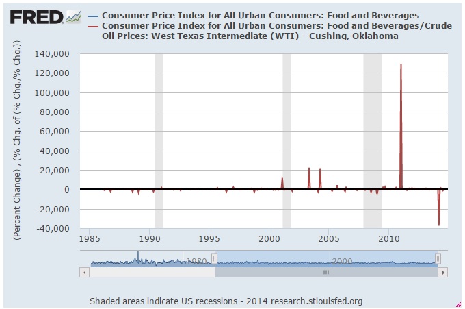
Those are some big price swings… So big that I cannot see how big the smaller swings are.
Gold priced in…
Back to the topic of gold,,,
Gold in terms of other things…
Gold in terms of US Dollars:
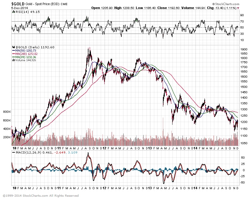
Compare this to…
Gold priced in terms of Yen:
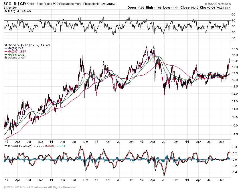
While the shape looks generally the same, the results are not. This view is what it would like to view gold if you lived in Japan. While I suspect my audience does not expand that far across the pond, it is important to look at items priced in different currencies to see whether they are actually in an up or down trend or it is actually the currency that is moving.
The IAG Inflation Monitor – Subscription Service
We are initially publishing this Inflation Monitor as a free service to anyone who wishes to read it. We do not always expect this to be the case. Due to the high demand for us to publish this service, we plan to offer it free for a while and when we feel we have fine tuned it enough, we do plan on charging for access. Our commitment to our wealth management clients is to always provide complimentary access to our research. If you would like to discuss becoming a wealth management client, feel free to contact us.
Sources:
- Federal Reserve – St. Louis
- U.S. Energy Information Administration
- U.S. Post Office
- National Association of Realtors
- The Economist
- The Commodity Research Bureau
- Gurufocus.com
- stockcharts.com
* IAG index calculations are based on publicly available information.
** IAG Price Composite indexes are based on publicly available information.
About Innovative Advisory Group: Innovative Advisory Group, LLC (IAG), an independent Registered Investment Advisory Firm, is bringing innovation to the wealth management industry by combining both traditional and alternative investments. IAG is unique in that we have an extensive understanding of the regulatory and financial considerations involved with self-directed IRAs and other retirement accounts. IAG advises clients on traditional investments, such as stocks, bonds, and mutual funds, as well as advising clients on alternative investments. IAG has a value-oriented approach to investing, which integrates specialized investment experience with extensive resources.
For more information, you can visit www.innovativewealth.com
About the author: Kirk Chisholm is a Wealth Manager and Principal at Innovative Advisory Group. His roles at IAG are co-chair of the Investment Committee and Head of the Traditional Investment Risk Management Group. His background and areas of focus are portfolio management and investment analysis in both the traditional and non-traditional investment markets. He received a BA degree in Economics from Trinity College in Hartford, CT.
Disclaimer: This article is intended solely for informational purposes only, and in no manner intended to solicit any product or service. The opinions in this article are exclusively of the author(s) and may or may not reflect all those who are employed, either directly or indirectly or affiliated with Innovative Advisory Group, LLC.

