| Index | Value | 1mo change | 1yr change | 5yr change | Inflation Score |
|---|---|---|---|---|---|
| Economic Inflation | |||||
| Consumer Price Index (CPI) | 238.13 | 0.43% | 0.85% | 6.56% | 2 |
| Producer Price Index (PPI) | 182.40 | 0.50% | -4.80% | -8.43% | 1 |
| 1 Yr Treasury Bill Yield | 0.66% | 0.13 | 0.41 | 0.40 | 2 |
| 10 Yr Treasury Note Yield | 1.79% | -0.02 | -0.08 | -1.67 | 2 |
| Real Interest Rate | -0.19% | 0.30 | -0.52 | 2.23 | 2 |
| US 10 yr TIPS | 0.17% | -0.40 | -0.08 | -0.79 | 2 |
| Capacity utilization | 74.80 | -2.48% | -4.35% | -1.71% | 2 |
| Industrial Production Index | 103.38 | -0.59% | -2.03% | 6.75% | 2 |
| Personal Consumption Expenditure Index | 12,495.20 | 0.09% | 3.76% | 18.86% | 4 |
| Rogers International Commodity Index | 2013.58 | 5.04% | -0.91% | -52.90% | 2 |
| SSA COLA | 0.00% | 0.00% | 3 | ||
| Median Income | $53.657.00 | 0.13% | 7.79% | 3 | |
| Real Median Income | $53,657.00 | -1.48% | -2.31% | 2 | |
| Consumer Interest in Inflation | Stable | 3 | |||
| IAG Inflation Composite | Strong Deflation | 1 | |||
| IAG Online Price Index | Slight Deflation | 2 | |||
| US GDP | 18128.20 | 0.38% | 2.91% | 19.03% | 4 |
| S&P 500 | 2072.78 | 4.77% | -1.05% | 55.67% | 3 |
| Market Cap to GDP | 116.80% | 122.40% | 90.10% | 4 | |
| Corporate Debt as % of Equity | 37.30% | -1.40 | 3.80 | -5.60 | 1 |
| US Population | 323,504 | 0.06% | 0.77% | 4.14% | 2 |
| IAG Economic Inflation Index* | Slight Deflation | 2 | |||
| Housing Inflation | |||||
| Median Home price | 222,700.00 | 5.00% | 5.70% | 39.36% | 5 |
| 30Yr Mortgage Rate | 3.69% | 0.03 | -0.08 | -1.15 | 5 |
| Housing affordability | 174.90 | 2.16% | -3.53% | 5 | |
| IAG Housing Inflation Index* | Mild Inflation | 4 | |||
| Monetary Inflation | |||||
| US Govt debt held by Fed (B) | 2,810.10 | 0.29% | 0.60% | 175.10% | 1 |
| US Debt as a % of GDP (B) | 104.17% | 3.67% | 1.19% | 12.08% | 2 |
| M2 Money Stock (B) | 12,660.70 | 1.33% | 6.19% | 41.20% | 4 |
| Monetary Base (B) | 3,910.70 | 0.50% | -3.78% | 61.72% | 3 |
| Outstanding US Gov’t Debt (B) | 18,922,179 | 4.25% | 4.30% | 34.92% | 4 |
| Velocity of Money [M2] | 1.48 | -0.74% | -2.63% | -14.93% | 2 |
| US Trade Balance | -47,060.00 | -2.57% | -22.08% | -7.64% | 1 |
| Big Mac Index | Expensive | 1 | |||
| US Dollar | 94.62 | -3.66% | -4.16% | 24.01% | 1 |
| IAG Monetary Inflation Index* | Mild Deflation | 2 | |||
| Energy | |||||
| Electricity (cents / KW hour) | 12.01 | -2.83% | -0.74% | 3 | |
| Coal (CAPP) | 42.30 | 0.12% | -29.57% | -46.11% | 1 |
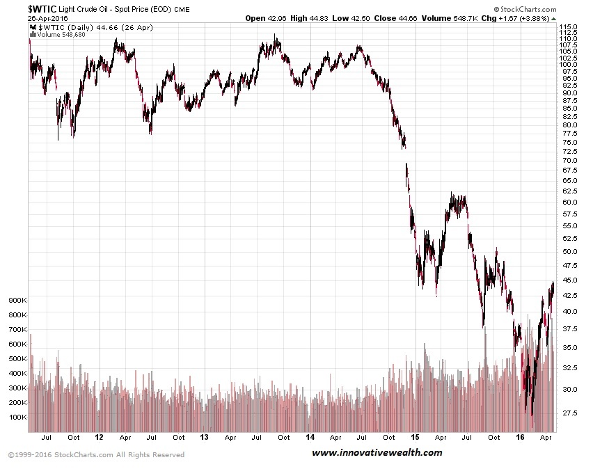
| Oil | 38.14 | 12.51% | -19.79% | -64.23% | 1 |
| Natural Gas | 1.96 | 14.80% | -25.56% | -55.44% | 1 |
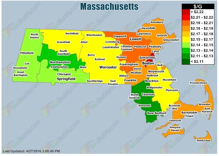
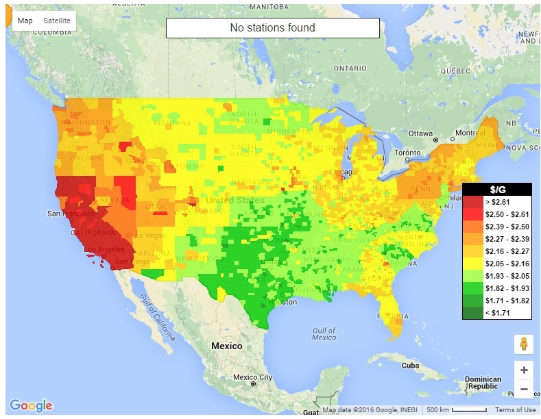
| Gasoline | 1.44 | 9.36% | -18.65% | -53.58% | 1 |
| IAG Energy Inflation Index* | Strong Deflation | 1 | |||
| Food and Essentials | |||||
| Wheat | 437.26 | -3.53% | -14.77% | -42.50% | 1 |
| Corn | 351.75 | -1.47% | -6.70% | -51.82% | 2 |
| Soybeans | 909.25 | 5.60% | -6.58% | -35.57% | 2 |
| Orange Juice | 147.20 | 15.63% | 18.23% | -9.36% | 5 |
| Sugar | 15.40 | 6.94% | 28.33% | -43.19% | 5 |
| Live Cattle | 124.50 | -8.89% | -22.86% | 3.06% | 1 |
| Cocoa | 2,941.00 | -0.07% | 9.45% | 0.10% | 4 |
| Coffee | 127.35 | 10.12% | -4.54% | -52.03% | 2 |
| Cotton | 58.26 | 2.79% | -7.45% | -71.01% | 2 |
| Stamps | $0.47 | -4.08% | 2.17% | 6.82% | 2 |
| CRB Foodstuffs Index | 349.54 | 0.00% | 0.53% | -31.75% | 2 |
| IAG Food and Essentials Inflation Index* | Mild Deflation | 2 | |||
| Construction and Manufacturing | |||||
| Copper | 2.19 | 6.07% | -20.28% | -49.05% | 1 |
| Lumber | 306.40 | 20.20% | 10.26% | 0.59% | 5 |
| Aluminum | 0.69 | 0.00% | -16.87% | -43.90% | 1 |
| CRB Raw Industrials | 440.43 | 0.00% | -6.00% | -29.58% | 2 |
| Total Construction Spending (M) | 1,143,971.00 | 0.27% | 10.26% | 43.21% | 5 |
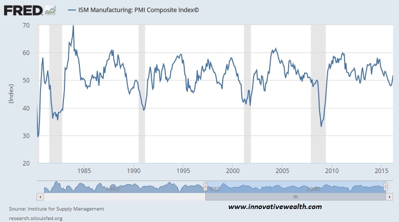
| ISM Manufacturing Index | 51.80 | 4.65% | -0.96% | -12.50% | 2 |
| IAG Construction & Manufacturing Index* | Strong Deflation | 2 | |||
| Precious Metals | |||||
| Gold | 1,234.10 | -0.39% | 4.30% | -13.93% | 3 |
| Silver | 15.45 | 3.52% | -7.07% | -59.03% | 1 |
| IAG Precious Metals Inflation Index* | Strong Deflation | 2 | |||
| Innovative Advisory Group Index | |||||
| IAG Inflation Index Composite* | Moderate Deflation | 2 | |||
* If you would like a description of terms, calculations, or concepts, please visit our Inflation monitor page to get additional supporting information. We will continually add to this page to provide supporting information.
* Our Inflation Score is based on a proprietary algorithm, which is meant to describe the respective category by a simple number. The scores range from 1-5. One (1) being the most deflationary. Five (5) being the most inflationary. These scores are meant to simplify each item and allow someone to quickly scan each item or section to see the degree of which inflation or deflation is present.
* We have also added our own indexes to each category to make it even easier for readers to receive a summary of information.
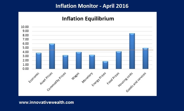
Inflation Monitor Summary – Composite Ranking
* The Inflation Equilibrium is a quick summary for the whole data series of the inflation monitor. If you don’t like statistics, this is the chart for you.
Inflation Monitor – April 2016 – Introduction
April Fool’s… every year people use this day to play practical jokes on others. This year it was the Fed’s turn to make fools of us all. Janet Yellen made a strong point early in her tenure as Fed Chair that she believed in more transparency with communications to the public about Fed policy. She must have a new years resolution this year that we are not aware of, because her transparency has taken a back seat to settling down the market gyrations. The Fed has always claimed that their decisions are not driven by the stock market, however their recent actions might suggest otherwise.
The Federal Reserve has gone from relative transparency to opacity in a short amount of time. Last year the Fed communicated to the public that they would raise rates by year end and that they would raise rates 4 times throughout 2016.
At the end of the year the Fed raised rates for the first time since the start of the financial crisis. Since then, there have not been any additional rate hikes. The market believes (and it is usually relatively accurate for at the moment data) that they may only raise rates 1-2 times in 2016. Ever since the stock market sold off earlier this year, the Fed has waffled on their view of raising rates. Their communications have become a undecipherable mess.
Chairwoman Yellen has claimed the Fed is data dependent. However, when the data changes to reflect that they should be raising rates, they change the rules of the game.
I think it is clear that they are no longer data dependent. So what are they dependent on? How are they making their decisions? Ouija board, tarot cards, magic eight-ball perhaps?
At the moment I’m not entirely clear on whether they are using core or headline inflation. Despite all her backtracking, Janet Yellen cannot take all the blame. She is not the only one muddying the waters. James Bullard has been flip flopping as well. A few weeks ago he said that rates should be postponed for a while, more recently he has been saying that rates should happen at the next meeting.
All of this flip-flopping might discourage the novice Fed watcher. They would look at these statements and have absolutely no idea what to expect next out of the Fed. That is exactly the point…
The fed doesn’t want to make a decision on rates at the moment. Flip-flopping is their way of biding time. Someone who has watched the Fed for some time would realize that one of their greatest tools is their public communications. Their use of information and disinformation allows them to move the markets without actually making any decisions.
Markets move on the expectations of future events. By the Fed stating that rates will go up 4 times this year. The market prices in these rate hikes, and rates started to rise in expectation of these future hikes. When the Fed decided that the hikes won’t happen as planned, rates started to drop in expectation of not meeting the 4 hikes in 2016. But what has actually happened from when they claimed 4 rate hikes and today? Nothing.
The reasons for doing this are that the Fed can balance the markets without actually making monetary policy changes in interest rates. As I stated last month, this is one of their greatest tools. However, when this tool stops working, you should worry. If people no longer trust the Fed, this will create a void of trust that may not easily be filled.
A few months ago I wrote about oil prices and where they might go next. To save you some time, it will be some time before oil prices move back to even a midpoint of where they were in mid-2014. Global supply is still exceeding demand, highly leveraged oil companies are still pumping out oil to pay the interest on their loans, and US oil production is still close (9mbd) to its peak of last year (9.6mbd). All of this adds up to oil prices not breaking out to a more sustainable price of production.
So what does all this have to do with inflation?
All the data points in the list above are indicators of a bigger picture of what is going on with inflation. Individually any one data point might show oil prices dropping, manufacturing improving, or the cost of stamps rising. However taken as a whole, you have a better picture of where the divergences exist.
For example, in the past 21+ months almost every commodity has significantly dropped in price. Are these data points an outlier? Not if they are all dropping. There is obviously a larger issue at hand. This issue might have little to do with inflation, but it will obviously impact other areas of the global economy. Actually, just to be clear on this point, lower commodity prices do not cause deflation, deflation causes lower commodity prices. It is important to understand the cause and effect of this reality.
In last month’s issue I stated, it would seem that most of the reasons commodity prices have fallen are due to China slowing down their consumption. Review that issue if you want to know more.
This month we have a lot of charts for you. I hope you find them informative.
I hope you enjoy this month’s Inflation Monitor – April 2016.
Kirk Chisholm
As always, please contact me with any questions or to send your feedback. Thank you for reading.
Join our email list to receive the Inflation Monitor sent directly to your inbox.
Charts of the Month
Asset Class Yields
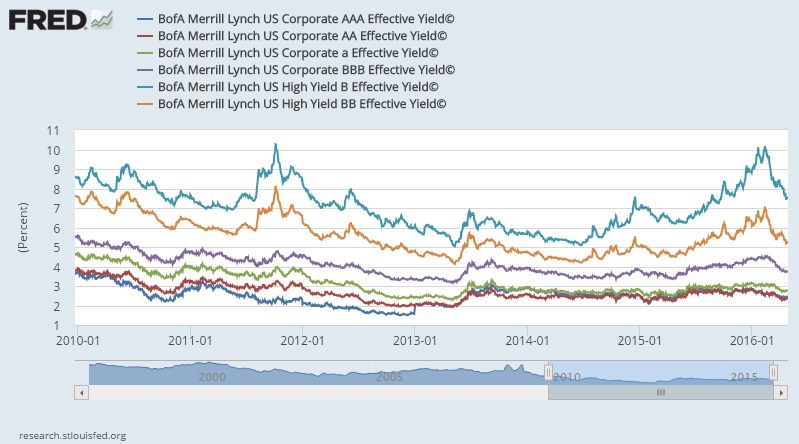
If you are looking for yield, this is a breakdown of the average yield for different asset classes. These yields are not very appealing. Ask yourself this question, If you are looking for yield, are you being paid enough to take risks?
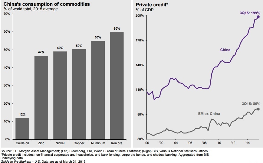
Its All About China
Commodities
Has China’s consumption of commodities been the driving factor in commodity prices? Absolutely. When you consume 60% of the world’s iron ore, 55% Aluminum, 50% of copper, 49% of nickle and 47% of zinc, the health of their economy will affect commodity prices for the entire global economy. While china is the second largest economy, their consumption of commodities was disproportionate to the size of their economy.You should also take any China data provided by the Chinese government with a grain of salt. Many analysts have claimed large discrepancies in their data.
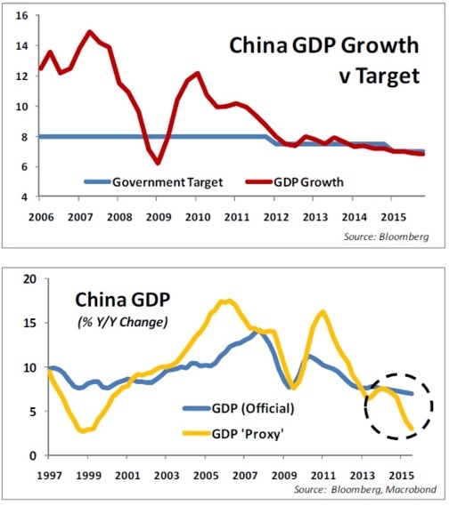
China’s GDP
Interesting view of China’s GDP growth. I have always felt that China’s data was useless due to its inaccuracies, but I thought this chart was interesting.
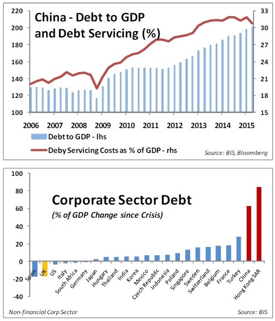
The chart below shows how China compares to other countries.
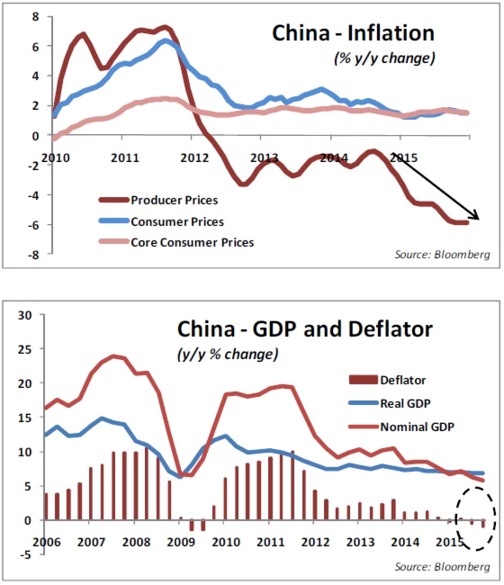
China inflation (disinflation)
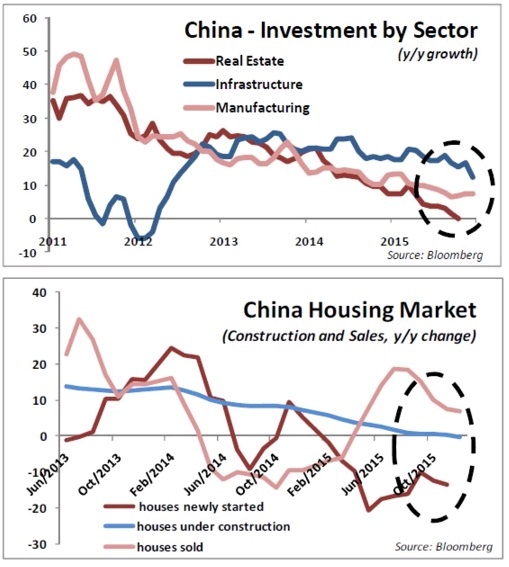
China’s real estate market
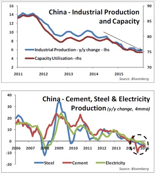
China industrial production
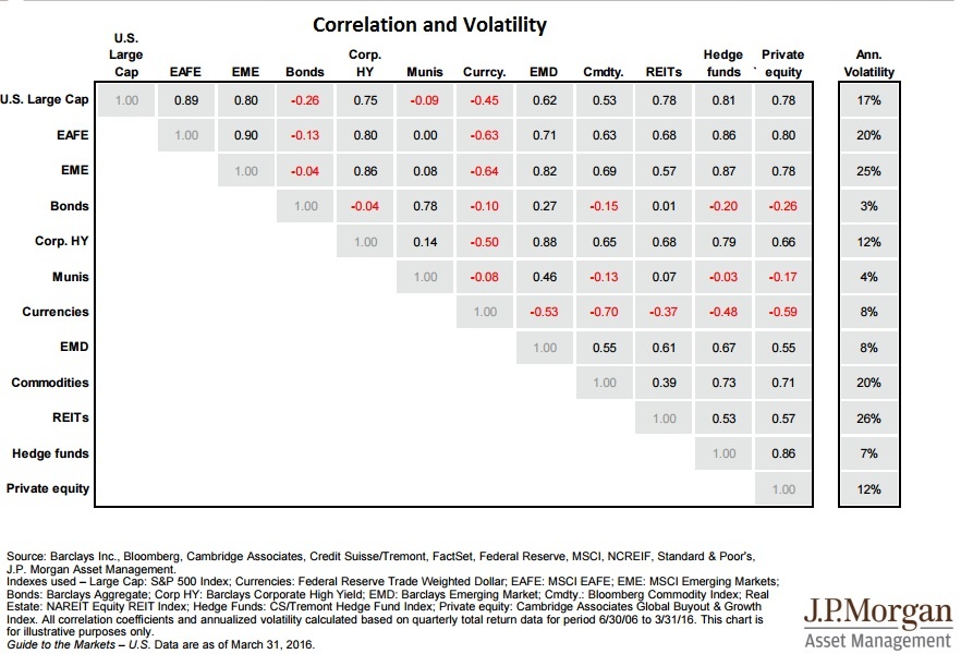
Asset Correlation & Volatility
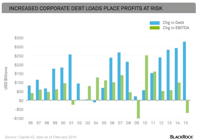
How debt affects profit in corporate america
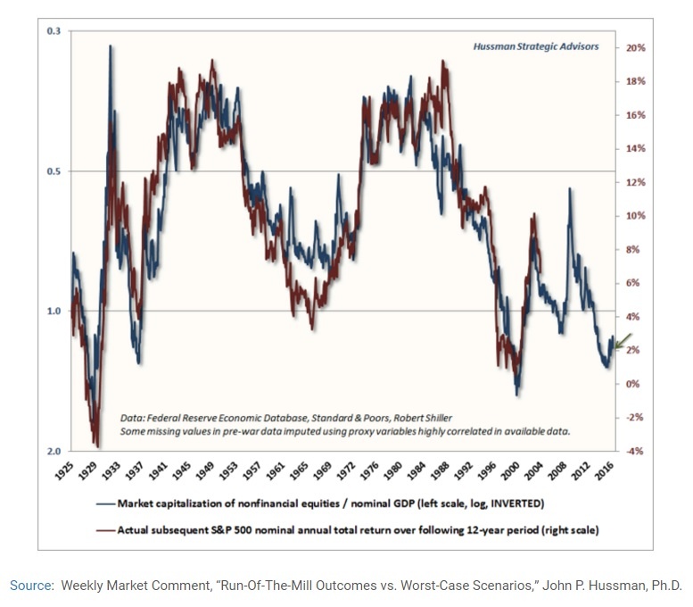
Market cap to GDP vs S&P 500 annual returns
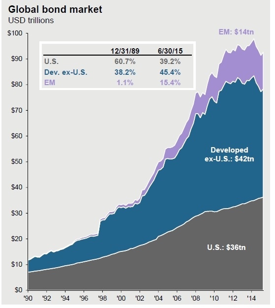
Global bond market
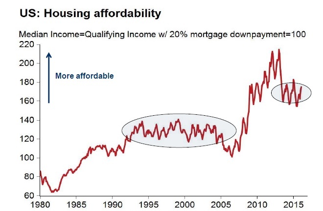
Housing Affordability
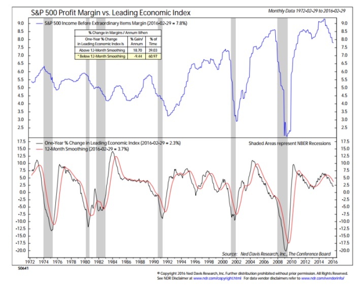
S&P 500 profit margins
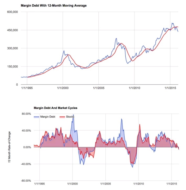
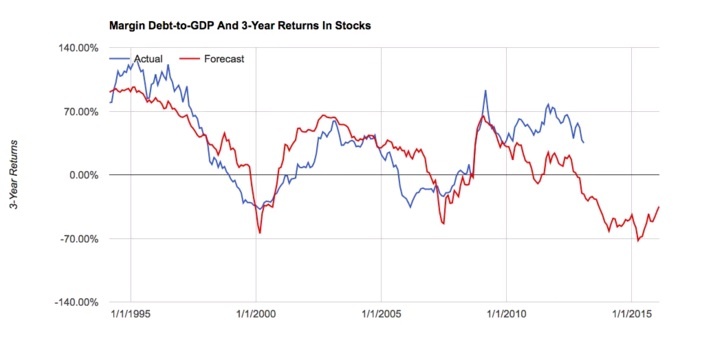
Margin Debt
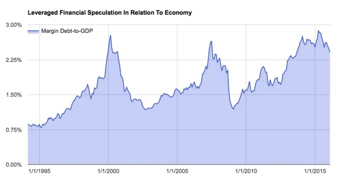
Margin Debt to GDP in US
Dividends and the S&P 500
Interesting Inflation Charts
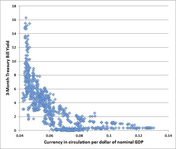
I think I am going to make this chart a permanent part of this inflation monitor so that the importance of it is not missed. John Hussman put this chart in one of his weekly reports a while ago. If I could find the report, I would link to it. You should definitely read his weekly reports. It was a great report about how interest rates relate to the amount of money in circulation. The basic idea is that as rates climb higher, there is less money in circulation, and when rates are low as they are today, there can be an enormous amount of money in circulation without causing high inflation. This idea is a basic concept in economics. However what is most interesting is seeing this visually.
Think of it this way, if hypothetically the US government can support a debt of $100 at a 5% rate of interest ($5 a year), then how much can the US support at 0.05%? $10,000 or a 100x increase. If rates are at zero, then the number becomes infinite. Now ,what if interest rates are negative, why wouldn’t the US print an infinite amount of money?
Obviously, this is hypothetical, but it is important to understand this principal. Once you do, then this is the important part you don’t want to miss. Look at the slope of the curve in this chart. While you may be able to exponentially increase the supply of money without increasing your debt service, the hard part is when you try to increase rates. You will learn very quickly that the debt is unsustainable. If you want to see why interest rates will not rise quickly around the world, this is it. Once you have created $10,000 in debt you will have to reduce it by 99% to reach the 5% rate you had originally. What are the chances of this happening?
Leading Indicators
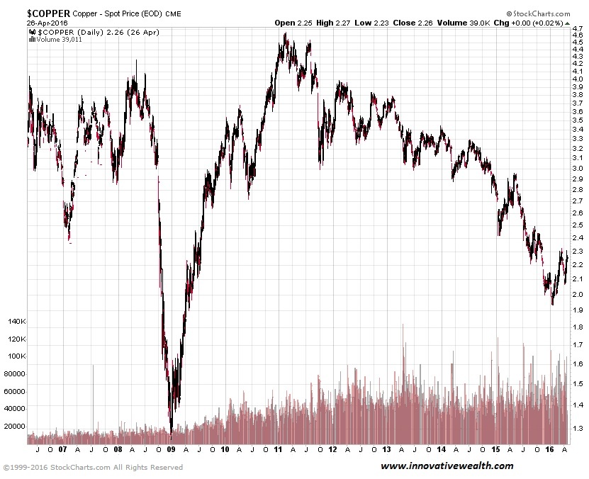
Dr. Copper
Dr. Copper is still weak, despite the recent bounce. the down trend is still in play. Much of this has to do with global demand… or the lack of it. Primarily this demand has come from China in the past 10 years. Unless China restarts its economy with a push for more manufacturing, it might be a while before copper regains its former highs.
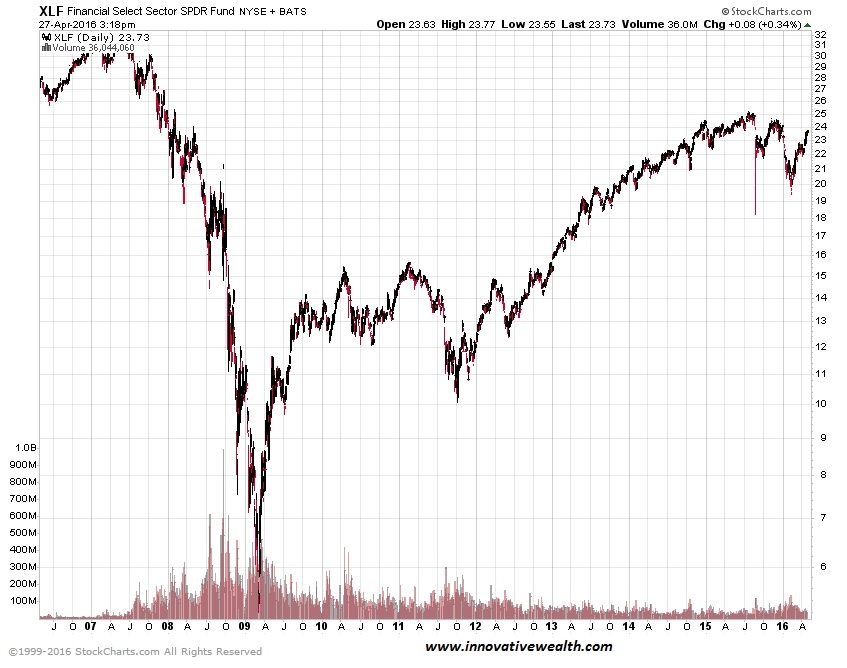
Financials
Fed decided to raise interest rates in December. While they have paused on their prior prediction of 4 rate hikes in 2016, there is still some indication that they will continue to raise rates. This should help financials. However, if the UYS economy follows the path of Europe and Japan, and negative interest rates are in our future, then the financial sector will most likely get hurt. What incentive is there for savers to put money in the bank if banks are charging them money to keep it there? Keeping money under the mattress might not be such a bad idea. Financials tend to be a leading indicator, so watch these closely.
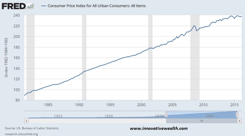
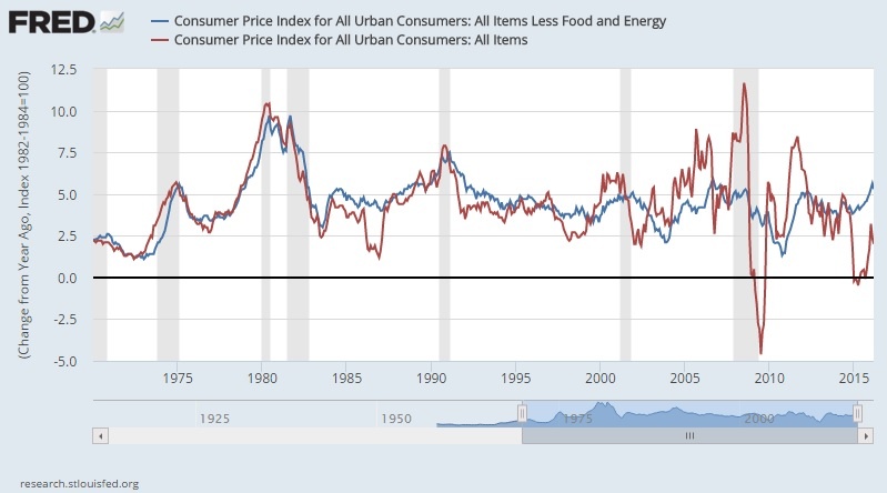
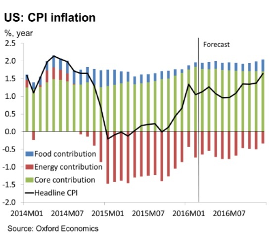
Consumer Price Index (CPI)
The CPI is flat for the year. If you have read this Inflation Monitor report for the last 12 months you will know that strong deflationary forces are here to stay. The Fed does not want deflation in the US, but can they stop it?
Should you use core or headline inflation? The difference is noticeable when commodity prices are volatile as they have been since 2000.
This shows how each part of headline inflation contributes to the number.
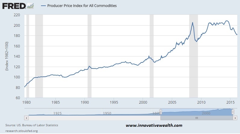
Producer Price Index (PPI)
The Producer Price Index is continuing to have a rough time this year. The declining PPI might be a reflection of the new economic conditions of producers and manufacturing with a high value of the US Dollar. This makes it harder for US companies to export goods since they will be about 20% more expensive from where they were last year.
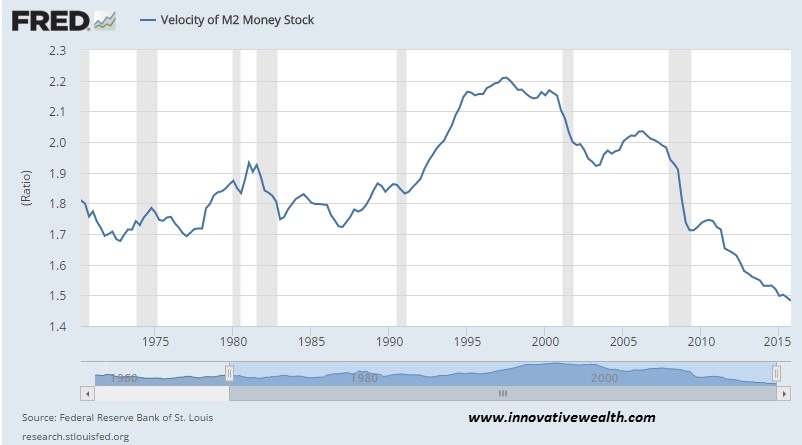
US Velocity of Money M2
There is just no sign of stopping this falling safe. I’ll believe in the hyper-inflation tooth fairy when this starts to turn up in a meaningful way.
ISM Manufacturing
There has been a small tick up in the past month. It is back over 50, meaning that there is growth.
Oil Prices
“We keep thinking that lower energy prices are somehow good for the economy. That can’t be, because energy prices or commodity prices in general don’t drive economic growth. Economic growth drives commodity prices.”
~Stephen Schork
Massachusetts Gas Prices
US Gas Prices
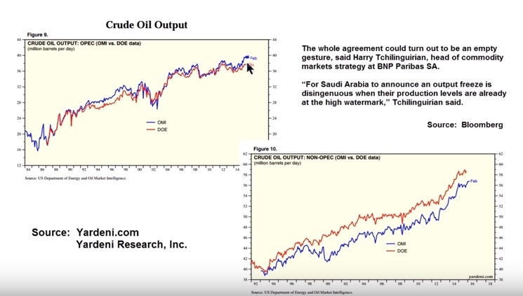
Oil Production
Here is an excerpt from Reuters: “Even if the pact is signed, it would have little impact on supplies, according to the IAE, because most of the countries involved have little capacity to increase output even if they chose to. “It doesn’t change balances on bit,” said Amrita Sen, Chief Oil Analyst at consultant Energy Aspects Ltd. in London. ”
Question for you to ponder… If oil output is still rising, or at least not falling, can you expect oil price to recover? How did that work out for Natural Gas?
Currency Relative Valuations to Gold
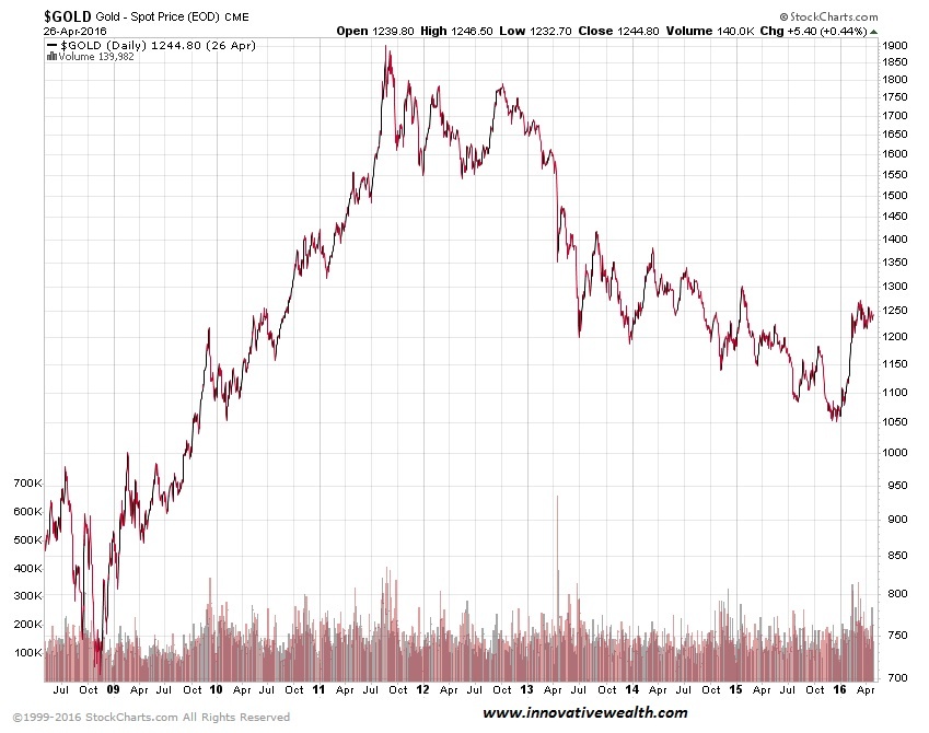
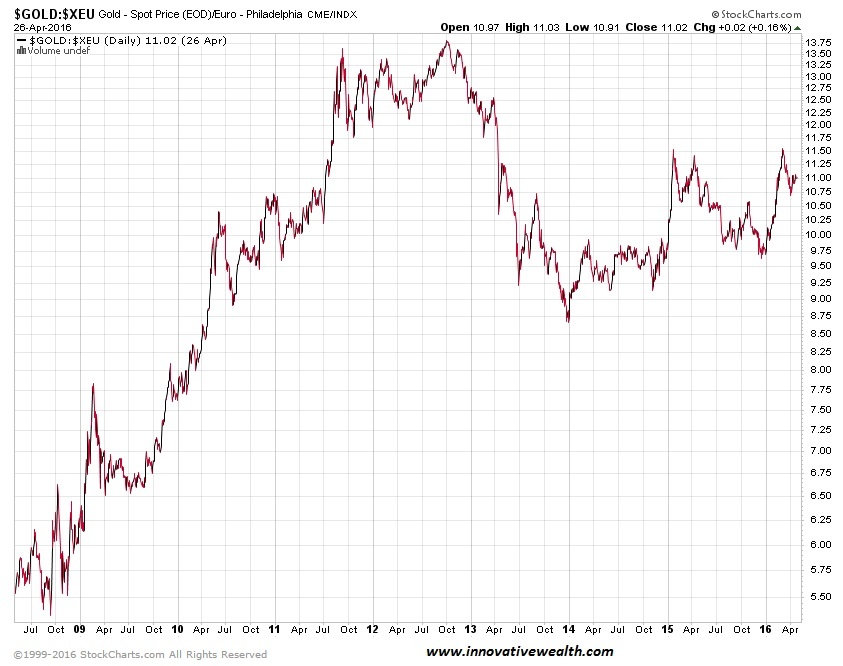
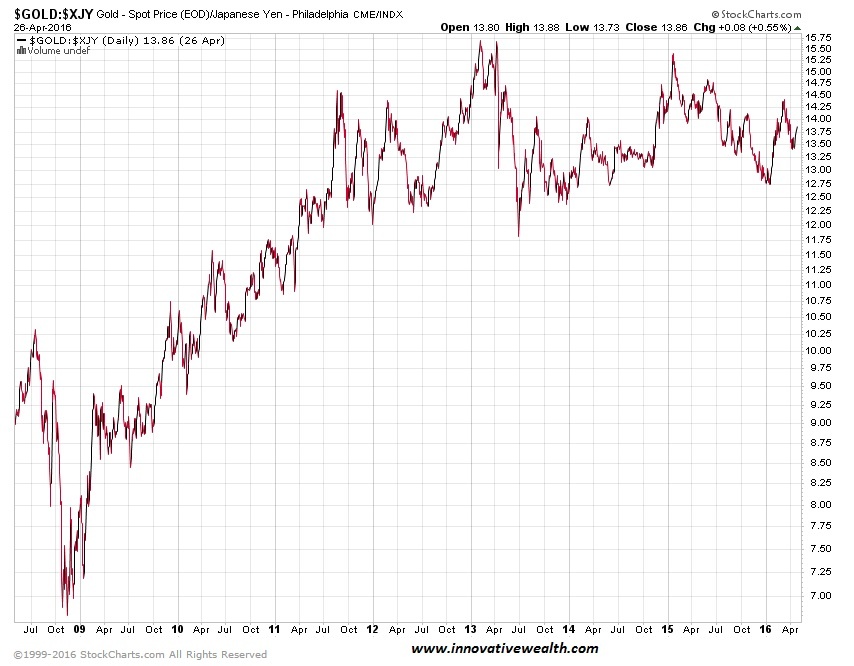
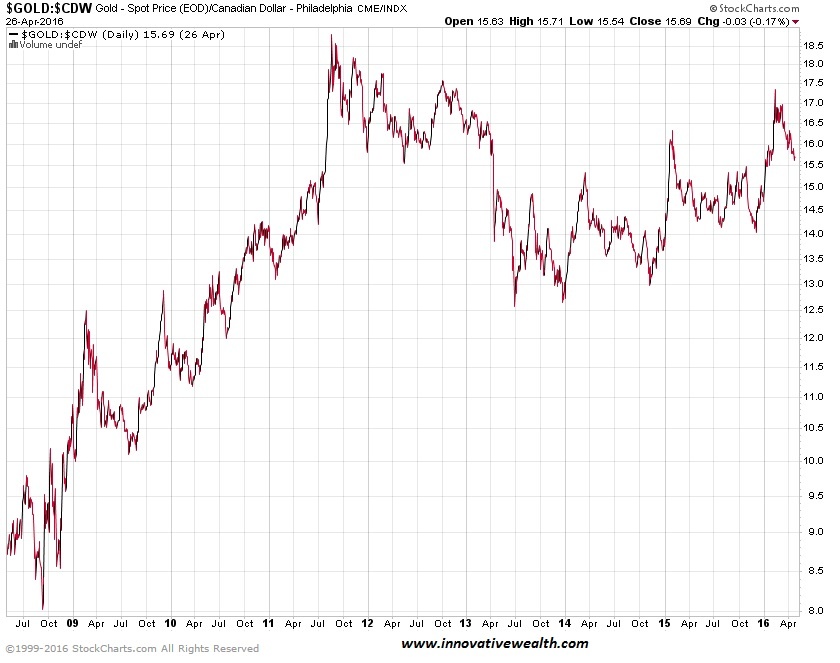
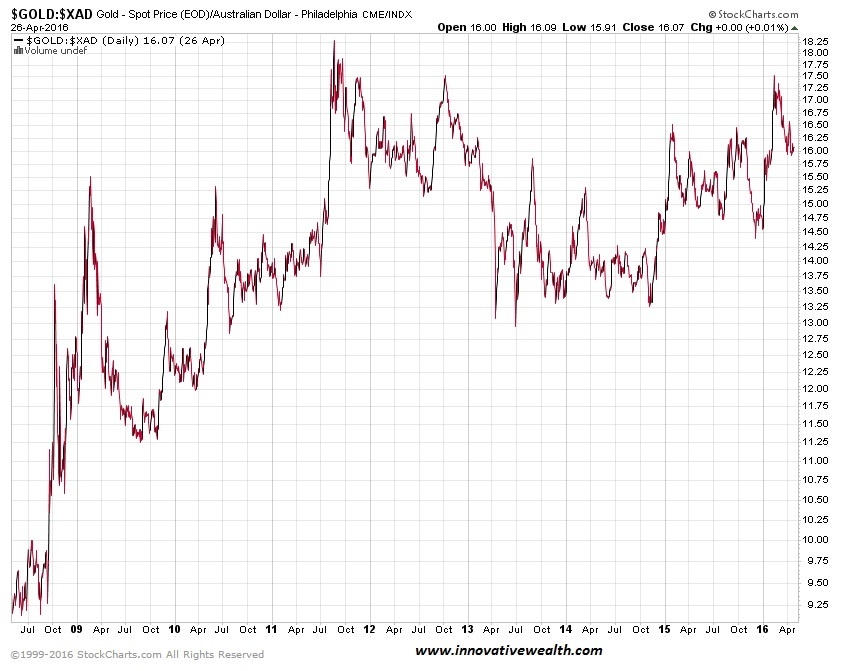
Gold is priced in the currency you use every day. If you live in the European Union, you use Euros, if you live in Japan, you use Yen, and if you live in the US you use US dollars. Each of these currencies are used to buy gold in their respective countries, so we look at gold priced in each country to see how people value it in their own currency. This can tell us a lot about the demand for gold inside and outside the US.
Gold prices are they strong or weak?
The best way to look at any commodity, especially gold, is to compare the commodity to multiple currencies. If gold is rising or falling in US Dollars, that means nothing if the other currencies are not showing the same thing. A true bullish trend in gold is when gold is rising in all (or at least most currencies).
For the past few months, gold has consolidated in the US and weakened in other currencies.
Gold Priced in Euros
Gold Priced in Yen
Gold Priced in Canadian Dollars
Gold Priced in Australian Dollars
Bonds
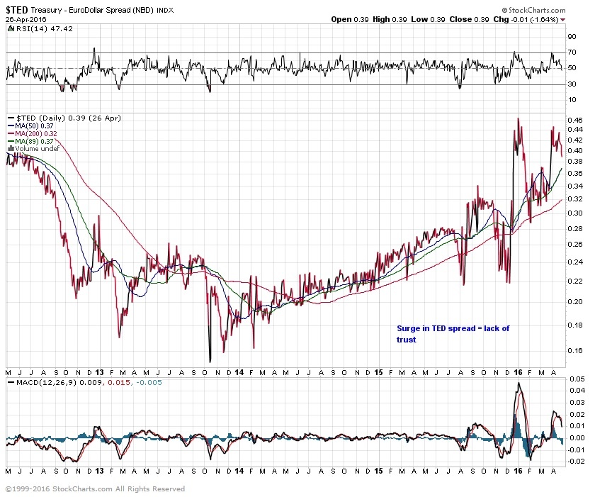
TED Spread
A surge in the Ted Spread means a lack of trust in financial institutions. Currently, the Ted Spread is on the high side. It is far off the 2008 highs of 4.6, but the upward trend is not a good sign, since it is confirming many other indicators.
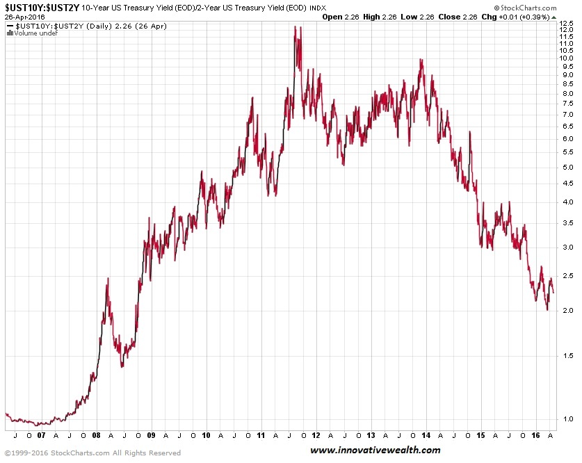
10 year vs. 2 year Treasury Spread
The flattening (or inverting) of the yield curve is not good for banks and also typically shows signs on a recession. It is probably one of the best indicators of a recession we have, yet no one knows the status of whether this indicator still works since interest rates are stuck at zero… sorry 0.25% – 0.50%. What happens if the US has negative interest rates? what will the curve look like then?
Treasury vs Corp Bond Spread
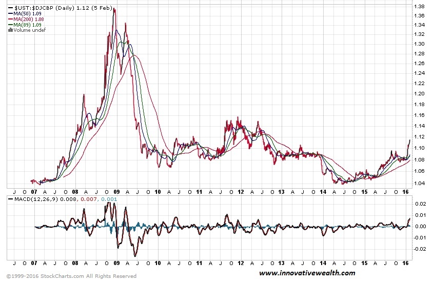
The spread between 30-year treasuries and corporate bonds is climbing, as it can be in times of market distress. It will be interesting to see how this plays out as interest rates start to rise… assuming they ever do. Most markets have shown some relief from the risk off pressures earlier this year, but this number is still rising.
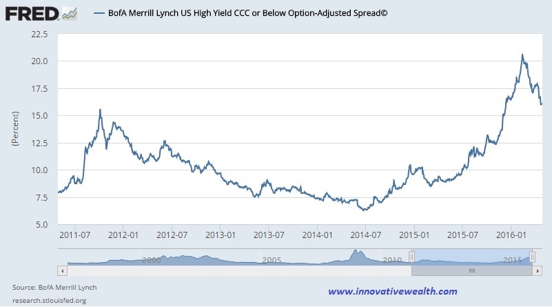
High Yield Bonds (Junk Bonds)
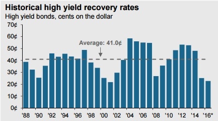
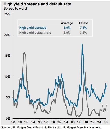
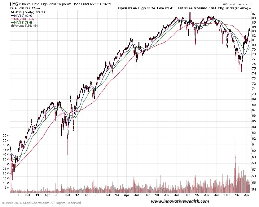
High yield bonds have had a good run of very low default rates. 2014 was around 1%. During recessions, these default rates tend to climb up to around 10% (1991, 2001, 2002, and 2009). This is fine unless you are getting 5% on your high yield bond income. In that case, you would net -5% a year. I’ll bet that is not quite what you had in mind when you were looking for income.
The end of 2015 and early 2016 went through a tumultuous period of time in the high yield bond market. 3 high-yield funds closed their doors in the matter of 3 days due to investors pulling their money out. You can read about this turmoil and the blueprint for financial contagion in my 2015 year end recap.
While the rebound in high yield bonds seems to suggest the worst is over, the “bad” bonds have not yet cleared. Unless oil prices continue to shoot back to $100/ barrel, I would suggest that there is still more bad news to come from the oil sector.
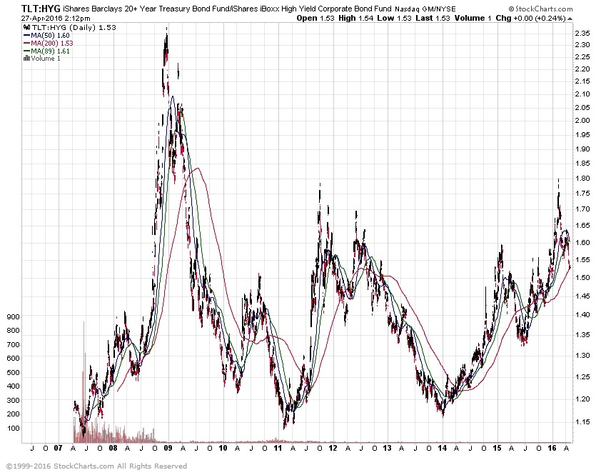
This shows the price of 30-year treasuries vs high yield bonds. The difference has continued to narrow. This is a good sign for the high yield bond and market and US economy in general. The spread is still high, but as long as it is declining, we should have less to worry about.
Bond Yield Spread
High Yield Bond Spread
The high yield bond market is continuing to cool down. This is a good sign for the overall market.
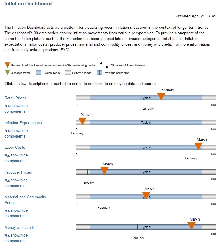
Inflation Dashboard
I like this view from the Federal Reserve because it gives more of a visual perspective of the data presented above.
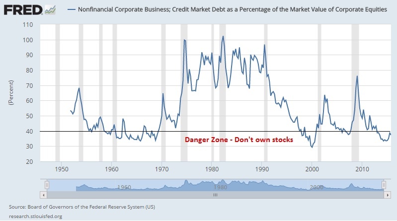
Corporate Debt as a Percentage of Equity
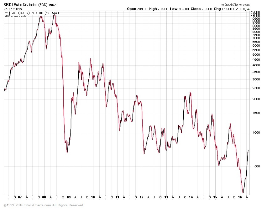
Baltic Dry Index
After breaking below the index all-time lows late last year, it has rebounded since then. It could be the rise in oil prices, or just that the index can only go so low, where any increase in activity would push it up. While this indicator is not all that important, it is just another piece of information that the global economy is not doing well. Until we see a sustained pickup in dry shipping, the global economy is still not strong.
Panama Papers
I had to mention this since it is so prominent and interesting to find out about the world’s financial secrets.
Here is a great article from Ambrose Evans-Pritchard, Panama Bombshell Spells Demise of Shadow Finance and Privacy
I hope you enjoyed this month’s Inflation Monitor. See you next month.
Cheers,
Kirk Chisholm
The IAG Inflation Monitor – Subscription Service
We have been publishing this Inflation Monitor as a free service to anyone who wishes to read it. We do not always expect this to be the case. We expect to charge a small fee for this service starting in 2017. The high amount of interest in this service has put constraints on us to provide more, so this small fee should cover our costs for providing this excellent resource. Our commitment to our wealth management clients is to always provide complimentary access to this research. If you would like to discuss becoming a wealth management client, feel free to contact us.
If you would like to automatically receive the Inflation Monitor in your email inbox each month, click here to join our subscription service.
Sources:
- Federal Reserve – St. Louis
- U.S. Energy Information Administration
- TD Ameritrade
- National Association of Realtors
- The Economist
- The Commodity Research Bureau
- Gurufocus.com
- Stockcharts.com
- GasBuddy
* IAG index calculations are based on publicly available information.
** IAG Price Composite indexes are based on publicly available information.
About Innovative Advisory Group: Innovative Advisory Group, LLC (IAG), an independent Registered Investment Advisory Firm, is bringing innovation to the wealth management industry by combining both traditional and alternative investments. IAG is unique in that we have an extensive understanding of the regulatory and financial considerations involved with self-directed IRAs and other retirement accounts. IAG advises clients on traditional investments, such as stocks, bonds, and mutual funds, as well as advising clients on alternative investments. IAG has a value-oriented approach to investing, which integrates specialized investment experience with extensive resources.
For more information, you can visit: innovativewealth.com
About the author: Kirk Chisholm is a Wealth Manager and Principal at Innovative Advisory Group. His roles at IAG are co-chair of the Investment Committee and Head of the Traditional Investment Risk Management Group. His background and areas of focus are portfolio management and investment analysis in both the traditional and non-traditional investment markets. He received a BA degree in Economics from Trinity College in Hartford, CT.
Disclaimer: This article is intended solely for informational purposes only, and in no manner intended to solicit any product or service. The opinions in this article are exclusively of the author(s) and may or may not reflect all those who are employed, either directly or indirectly or affiliated with Innovative Advisory Group, LLC.

